


Interior Series with Jack Thompson & Co. | 5 Benefits of a Home Paint Colour Consultation
- Interior Design
Spence Willard are proud to collaborate with
Jack Thompson & Co.,
to bring you the latest interior design ideas, hints & tips
No. 1. Eliminate the pressure to “get it right”
Many of our clients have agonised about selecting from various shades of white, wanting to play it safe but this can be boring and leave people feeling deflated about the process, having spent money on many sample pots and time procrastinating about making the right decision.
We encourage you to go with what you like and ignore what other well intended people might be saying, also avoid following trends for the sake of it if they don’t fully resonate with you.
Keep it simple: what colours do you particularly like?
Look at what you are wearing and your favourite clothes combination for inspiration, all the clues are there to start a great scheme!
Image: Craig & Rose – Morris Blue
No. 2. White or very light shades are often not the best to brighten a space
White or very light shades tend to look dull and grey under the British light. What works in Southern Europe, Australia or US does not work over here.
What does work are warm and darker shades, particularly if they echo the local nature.
We believe that people would benefit from considering much darker shades than they think.
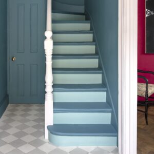
Image: Craig & Rose – Saxe Blue
No. 3. The use of sticky colour patches is ideal to select a colour
Avoid placing these patches against the wall colour you want to replace though, as it will skew your perception of what it will look like and might negatively influence you.
Instead, place the patch against what will remain in the room, might it be the floor covering, furniture or sofa/curtain fabrics?
Create a mood board – if it works on the board, it will work on all walls, in any light and season.
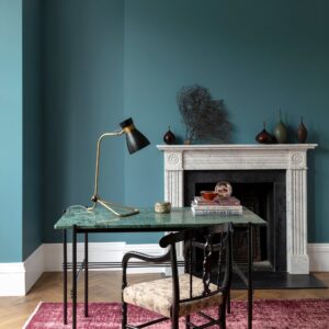
Image: Craig & Rose


No. 4. Restriction helps when choosing paint colours
Make decisions based on what you already have and want to keep in a room, as well as the existing colours in the other rooms since you want to keep a visual flow throughout your home.
Look at your furniture, accessories, flooring and focus on what goes well with them.
Restricting your search to one brand such as heritage brand Craig and Rose (our chosen paint supplier at Jack Thompson & Co) helps to make the process much easier as a wide range of choice often becomes overwhelming.
Image: Craig & Rose – Eau de Nil
No. 5. Avoid leaving your ceiling pure white
It tends to make a room feel unfinished or in some cases, it might contribute to a feeling that the height is lower than it is.
Pick a complementary colour or consider colour ‘drenching’ meaning painting your ceiling the same colour as your walls, skirting boards, doors and windows. This makes a room much more interesting, cosy and up to date.
Image: Holly Jolliffe for Jack Thompson

Jack Thompson & Co are offering complimentary paint colour consultations to Spence Willard clients
Speak to them at:
✉design@spencewillard.co.uk ☎07905 333422